top of page

more than a meat thermometer
As part of a group project for a Prototyping and Implementation course, we developed ThermoEye, a smart meat thermometer system integrated with a mobile app and smartwatch. Designed for novice cooks, the app provides real-time updates, recipe suggestions, and step-by-step cooking guidance to ensure perfectly cooked meat every time.
We followed a user-centered, iterative design process—conducting initial user interviews to define needs, creating personas and scenarios, and running a design charrette to generate ideas. Using Axure, we developed low- and mid-fidelity prototypes, then conducted usability testing with six participants to refine functionality and interaction. Insights from testing informed the design of our high-fidelity prototype, which incorporated branding and visual styling to complete the user experience.
The pitch:
-
Conceptualized for a group project, ThermoEye is a smart meat thermometer utilizing both a mobile phone and a smart watch
-
It’s more than just a thermometer, it is also an app that can help one learn to become an expert meat cooker.
-
It helps novice cooks who worry about meat being under(or over)cooked.
-
On the app, you can find various recipes for beef, poultry, and fish or you can even add your own custom recipe.
-
With your watch, ThermoEye will help keep you notified on how your meat is doing, when it’s time to flip, remove from the heat, and ready to eat.


design process overview
For this project, we followed an iterative design approach that is user-centered. We asked for user feedback throughout our process to make sure we were addressing the users’ needs and goals. Fiirst, we interviewed users about their thoughts and needs on a device such as ThermoEye. From the interviews, we were able to synthesize the data gathered and created personas and scenarios that identified our requirements for the interface. We then moved towards Ideation and conducted a design charrette exercise among the team to create the initial lo-fi wireframes of our app. As a team, we iterated on our lo-fi prototype, making sure we addressed the needs identified in our personas/scenarios. From our lo-fi prototype, we created the mid-fi interface utilizing Axure.
Once we had our mid-fid prototype, we conducted a second round of interviews and a usability testing through Axure. We tested 6 participants and focused primarily on the interaction and less on visual design. We wrote out a script and questions for our screens and received helpful feedback from our testers. We then collected the data and as a team, decide on key changes for the next iteration. We applied their feedback to the hi-fi prototype, which included branding and styling.
design tenets
-
Improve temperature accuracy when cooking meat and poultry.
-
Enable multitasking while cooking.
-
Empower novice cooks with the confidence to prepare meat like a chef.
-
Easy to navigate user interface.
-
Transparency in process; provide feedback to users so they will not get lost.
-
Modern look that utilizes white space and keeps things simple.
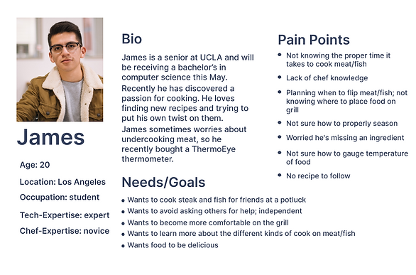
scenario & persona
James Lee plans to attend a potluck with his friends for the football game this upcoming weekend. James plans to utilize the grill at his friend's place to cook a steak. Since James doesn't have much experience grilling, he opens ThermoEye to look at recipes and gather the correct ingredients.
At the potluck, James connects the Smart Meat Thermometer with the phone application, then plugs it into the steak and puts them on the grill. He leaves the grill to watch the game on the TV in the living room. He receives a notification on his phone to flip the steak. He returns to the grill to follow the app's instructions. After flipping the steak, he goes back to the game. The app notifies him again but this time, to remove the steak from the grill to rest. Finally, the app notifies James when the the meat is ready to serve to his friends.
design charrettes
We utilized the design charrettes exercise for ideation.
Each team member came up with a couple sketches of what the interface should look like and how it’ll function.
From this exercise, we were able to identify common functionality throughout the various sketches and use them to create our narrative digital prototype.
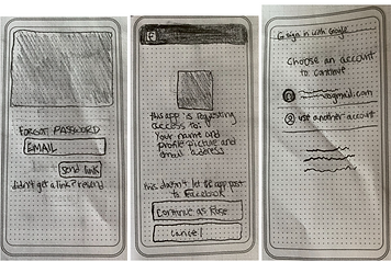

lo-fi prototype

narrative digital prototype


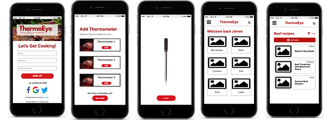
mid-fi prototype
From our lo-fi prototypes, we iterated to a mid-fi version in order to conduct interviews and usability testing.
In the mid-fi prototype, we focused primarily on the interaction and less on visual design.

usability testing
The focus of this class was on prototyping rather than the testing process which is why the usability testing is minimal.
Usability testing was conducted separately by each team member to identify strengths and potential areas of improvements for ThermoEye application.
Overall, the prototype received positive feedback and demonstrated to be an application useful and easy to navigate.
-
# of Participants: 6 potential users
-
Testing Time: 20 minutes
-
# of Task: 4 tasks
design changes
These are changes that were chosen as top priority and implemented for prototype v2: High Fidelity.
Sign up Page
-
Add username field
Add Thermometer
-
Add one thermometer option instead of three thermometers to sync.
Find a Recipe – Homepage
-
Add another flow for going straight to temperatures instead of following a recipe
-
Add Recipe option from Homepage
Find a Recipe – Beef Recipe page
-
Work on ability to Filter your favorite recipes/what shows up first in list of recipes
Start Recipe – Directions
-
Include ingredients on the directions page as well.
Temperature/Ready page
-
Include breadcrumb so user can return to recipe if desired
-
Include an option to save recipe
Share
-
Add Instagram as a sharing option


bottom of page